Buttons
Like most, if not all GUI supporting languages, Views allows a user to have different buttons in their GUIs. These Buttons have different properties that can be used by the users building GUIs.
The list below contains the properties that a button can have:
|
Button
|
| Name |
This property indicates the Name of the component, being S. S should be included in single or double quotes.
| Text, TextAlign and Image |
A button can either have Text or an Image on it. It can even have both Text, describing its functionality, and an Image on it. The TextAlign property specifies the alignment of text on the Button and its value CA can be any of the member names of the System.Drawing.ContentAlignment enumeration type, which are TopCenter, TopLeft, TopRight, MiddleLeft, MiddleCenter, MiddleRight, ButtomLeft, ButtomCenter, or ButtomRight. The value S is as it has been described above. The value of Image F denotes the filename. The filename is written using typical windows notation, and it should be included enclosed by the single quotes.
| Width and Height |
These properties are used by many components such as text boxes and so on. These are used to specify the width and the height of the component. The value that these properties have, being M, denotes the size in decimal numbers followed by the units of measure. The recognized units are: pt or point for points, in or inch for inches, mm for millimetres, cm for centimetres, pc or pica for picas, dd or didot for didots and cc or cicero for ciceros. If these units are omitted, the default is points.
| ForeColor and BackColor |
ForeCore property is used to set the color for the text on the button, and BackColor property sets the Background color on the button.
| Font |
This Attribute Specify the appearance of Text on the Button. "Bold12" indicate a 12 point and Bold font.
| halign and valign |
halign denotes the horizontal alignment of the button, and its value HA can be Left, Right or Center (views will accept spelling "Centre" as well). The valign property denotes the vertical alignment of the button. Its value VA can be Top, Middle or Bottom
Examples of the Buttons
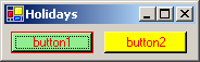
Example 2.1.1: Source
The example above will generate the following image.
Example 2.1.2: Source
The example above will generate the following image.

<<PREVIOUS | NEXT >>