Radio Buttons & Group Box
1. Radio Buttons
Radio Buttons enable a user to choose only one option amongst various options, i.e. Radio Buttons may only be placed inside a GroupBox, and only one Radio button within the GroupBox can be selected at a time. Clicking one radio button causes it to be checked and the previously selected button to be left unchecked. The Radio Button provides the following attributes
Name = S, Text = S, TextAlign = CA, Checked = B, Height = M, Width = M, ForeColor = C, BackColor = C, Font = FNT.
The only attribute that is worth discussing is the Checked attribute. The other ones are exactly the same as the ones discussed in the Button section.
| Checked = B |
Checked is a boolean attribute which is false by default. The value of the Checked attribut is set to true by clicking or selecting a radio button (see the example below).
2. Group Box
GroupBox is used for grouping RadioButtons. Each item between open and close tags must be RadioButton controls. GroupBox has atrributes already discussed in the Button section. These attributes are:
Name = S, Text = S, Image = F, Height = M, Width = M, ForeColor = C, BackColor = C, Font = FNT, halign = HA, valign = VA
Examples of RadioButtons and GroupBox
Example 3.1.1: Source
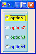
| @"<Form Text=
'Radio Buttons'> <Horizontal> <GroupBox BackColor = LightBlue> <RadioButton Name = b1 Text = option1 Checked = true Font = Bold10 BackColor = Yellow/> <RadioButton Name = b2 Text = option2 Font = Bold10 ForeColor = Red/> <RadioButton Name = b3 Text = option3 Font = Bold10 ForeColor = Green/> <RadioButton Name = b4 Text = option4 Font = Bold10 ForeColor = Blue/> </GroupBox> </Horizontal> </Form>"; |