ProgressBar
The ProgressBar displays a horizontal bar showing progress in completing a task. The ProgressBar has the following attributes:
Name = S, Height = M, Width = M, ForeColor = C, BackColor = C, Font = FNT, halign = HA, valign = VA, Minimum = N, Maximum = N, Value = N.
The Minimum, Maximum and Value attributes all have integer values. The Minimum attribute defines the lower range whereas the Maximum attribute defines the upper range of the Progress Bar. If these attributes are not set, by default progress ranges from 0 to 100. The Value attribute controls the initial state of the progress bar. By default, the Value attribute is equal to the Minimum attribute value.
To check how the other attributes works, see Button attributes.
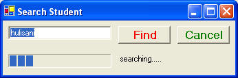
Examples of Progress Bar
Example 3.2.1: Source
| @"<Form Text= 'Search
Student'> <Vertical> <Horizontal> <TextBox Name = txtbox Text = 'hulisani'/> <Button Name = b1 Text = Find ForeColor = Red Font = Bold12/> <Button Name = b2 Text = Cancel ForeColor = Green Font = Bold12/> </Horizontal> <Horizontal>b <ProgressBar Name = pbar Value =20 height = 20 width = 150/> <Label Name = lab Text = 'searching.....' /> </Horizontal> </Vertical> </Form>"; |
The example above will generate the following output.