ReadOnly
Input Controls
Input controls in views can be divided in to three components namely TextBoxes, CheckBoxes and RadioButtons. The common attributes between these components are:
1. Name
2. Text
3. TextAlign
4. Width
5. Height
6. ForeColor
7. BackColor
8. Font
The following are only common between the TextBoxes and CheckBoxes:
9. halign
10. valign
These attributes are as the ones discussed on the Buttons section. Below we discuss the extra attributes that each component provides and give examples on how these components can be utilised.
1.Text Boxes
A TextBox is simply a Box for Display or Input for a single line. The extra attribute that the TextBox has is:
|
ReadOnly |
This is a boolean attribute. Meaning, if the attribute setting ReadOnly = true is provided, the TextBox may be used for display only. If ReadOnly = false is set then the TextBox may be used for both display and input. By default the ReadOnly attributes takes the false value.
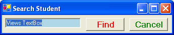
Example of TextBoxes
Example 2.3.1: Source
|
string fs = @"<Form Text= 'Search Student'> |
The code above will generate the following output.
2.Check Boxes
A CheckBox is responsible for inputting an On/Off value. The extra attribute that it provides is:
| Checked = B |
Where B indicates a boolean attribute. The attribute setting Checked = false is default, and it causes the CheckBox to be left unchecked. Any other value will cause the CheckBox to be checked.
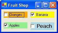
Examples of CheckBoxes
Example 2.4.2: Source
| @"<Form Text= 'Fruit Shop'> <Vertical> <Horizontal> <CheckBox Name = choiceOrange BackColor = Orange Text = 'Oranges' /> <CheckBox Name = choiceBanana BackColor = Yellow Text = 'Banana' Checked = true/> </Horizontal> <Horizontal> <CheckBox Name = choiceApp Text = 'Apples' BackColor = LightGreen Checked = true/> <CheckBox Name = choicePeach Text = 'Peaches' BackColor = LightBlue Font = Bold12/> </Horizontal> </Vertical> </Form>"; |
The code above will generate the following output.
3. Radio Button
See the GroupBox & RadioButton section.